Background
Understanding the Problem
User's found UBWA's Dive registration system to be too difficult to navigate and out of date as a Microsoft Word based application form.
Defining the Goal
Convert a cumbersome Dive Registration document into an intuitive web based application process that can streamline dive site registration for users and save them time.
UBWA Logo (Made in Procreate)
Identifying Users
Users were identified as divers that used the Word based application form. Looking at UBWA's record we found 26 users, mostly in their early to mid 30's, with a career in the Diving Industry.
User Interviews
We spoke virtually with 12 users and asked about their experience with the current system.
- "Walk me through your process of registering for a dive."
- "What are your pain points when using the application form?"
Users stated that the registration documents and references were tedious, laborious, and downright maddening. Users expressed feeling a decent amount of frustration, trying to register while simultaneously having to continuously change tabs for reference information. A lot of the questions on the form rarely applied to them, depending on their dive status.
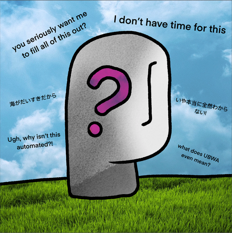
Where we didn't want users to end up.
Design
Wireframes
Beginning with rough hand drawn sketches, I moved to refined paper wireframes with questions broken out by section and notes on conditionality for certain questions dependent on how a user responded.
(Wireframe sketches were done by hand with real world information, as such, I'm unfortunately unable to share publicly).
Low to Hi-Fi Prototype
With a better sense of the layout for the application form, working with a team member from product we ideated on question phrasing, question order, and what questions would drive conditionality for other questions. I also worked with the Dev team, making sure functionality such as "default state" and auto fill was feasible with our rather short allowable time frame.
Based on insight gained previously during the research stage, the following design changes were implemented:
- Instead of pilfering through unrelated questions, users are “driven” towards a set of questions based on their previous answers.
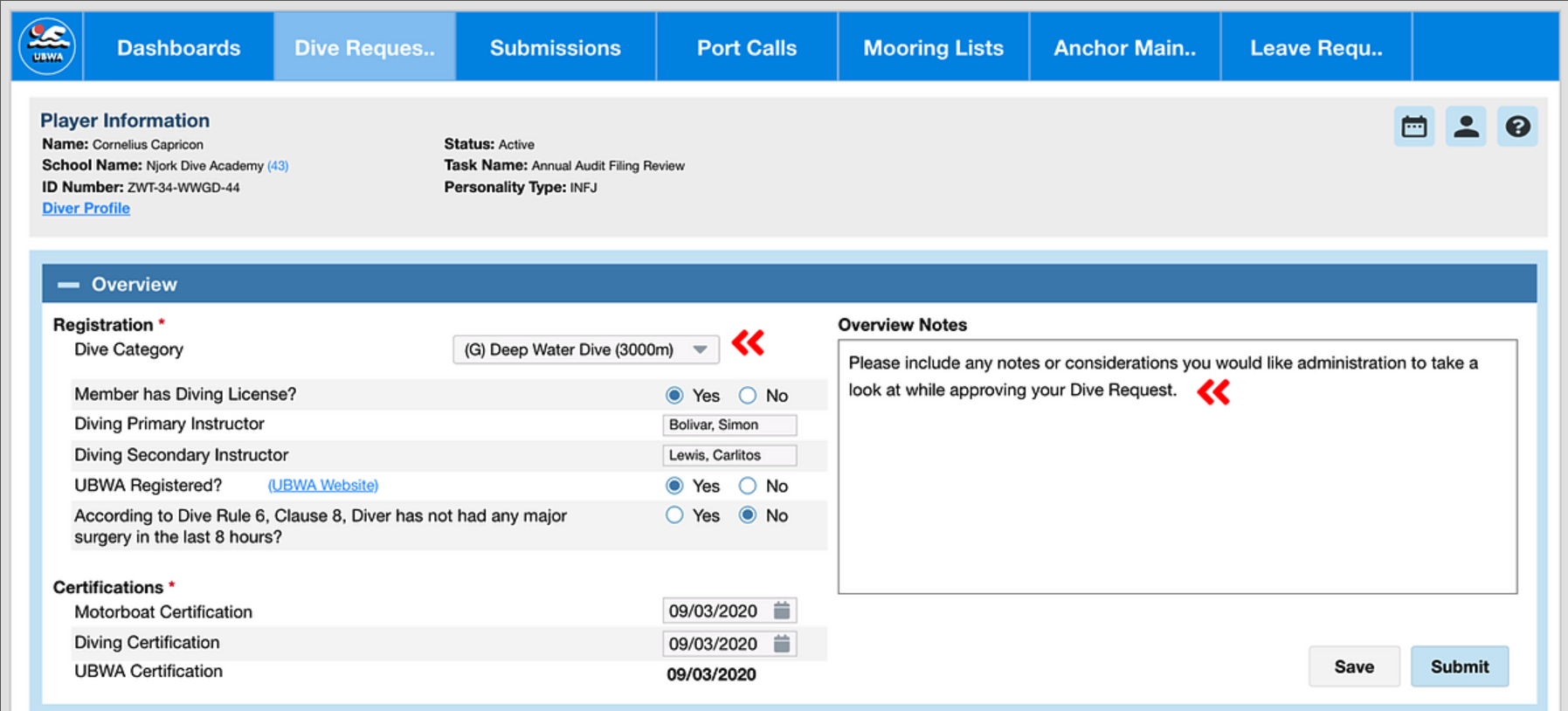
If users are registering for a deep dive, they only see deep dive related information.
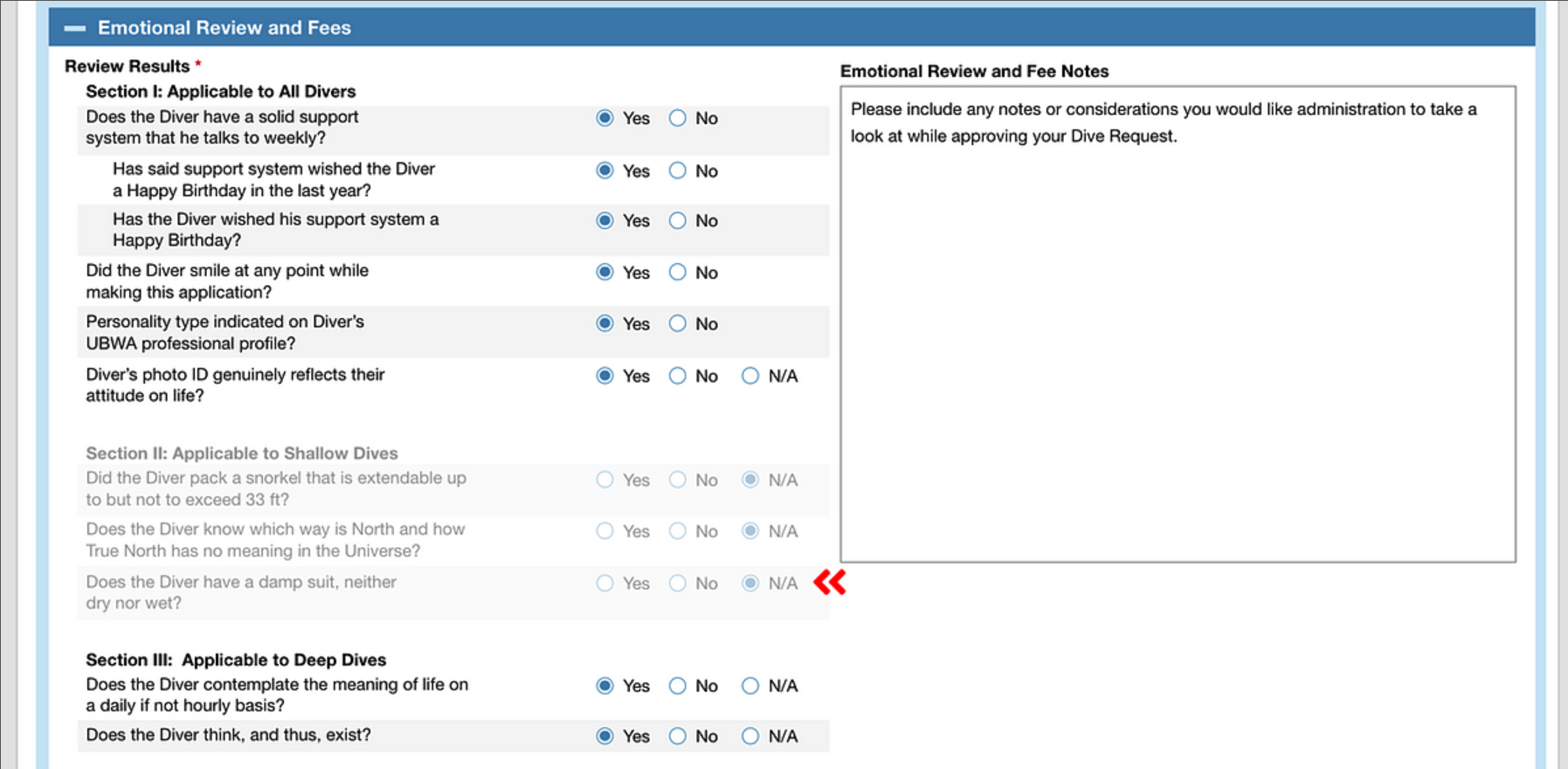
As users progress through the application, they are presented with only relevant sections.
- Include a document required checklist in the application itself, instead of flipping through cumbersome, off screen documents to check which document they need to attach.
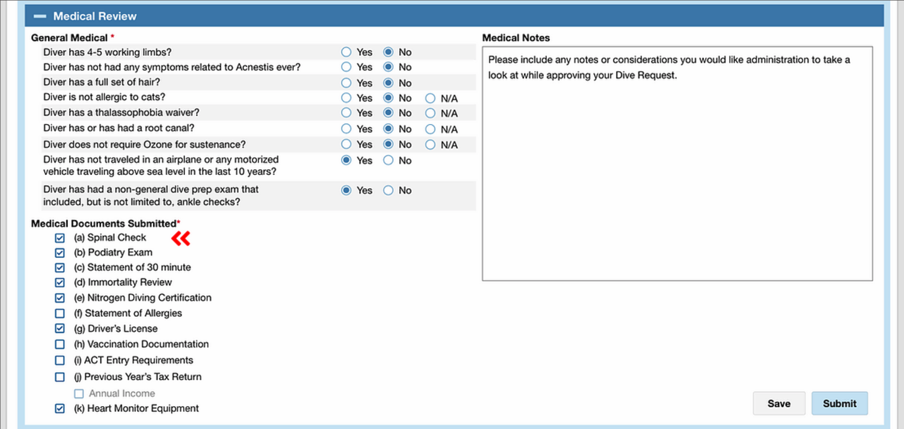
Users can now view which documents are required for submission on the Form itself.
- Users are able to simply input the amount of money they have “donated” directly into the application and immediately shown the difference between how much they submit and how much is “owed.”

Users can quickly input data and immediately receive feedback on their donation status.
User Testing
With the refined mockup in hand, I met again with our original 12 users 1 on 1 and gained insightful feedback to guide my design direction as they filled out the new form.
Key Feedback
- Wording of some questions, while correct, may be confusing to newer users.
- Although redundant, having the question "Are dive instructors the same" would be a nice visual reminder even though users must manually enter each instructor's name.
- A "N/A" radio button option may be required depending on how users answer certain questions.
Prototype
I took this feedback, iterated my design, and included interactivity for a usability test with users.
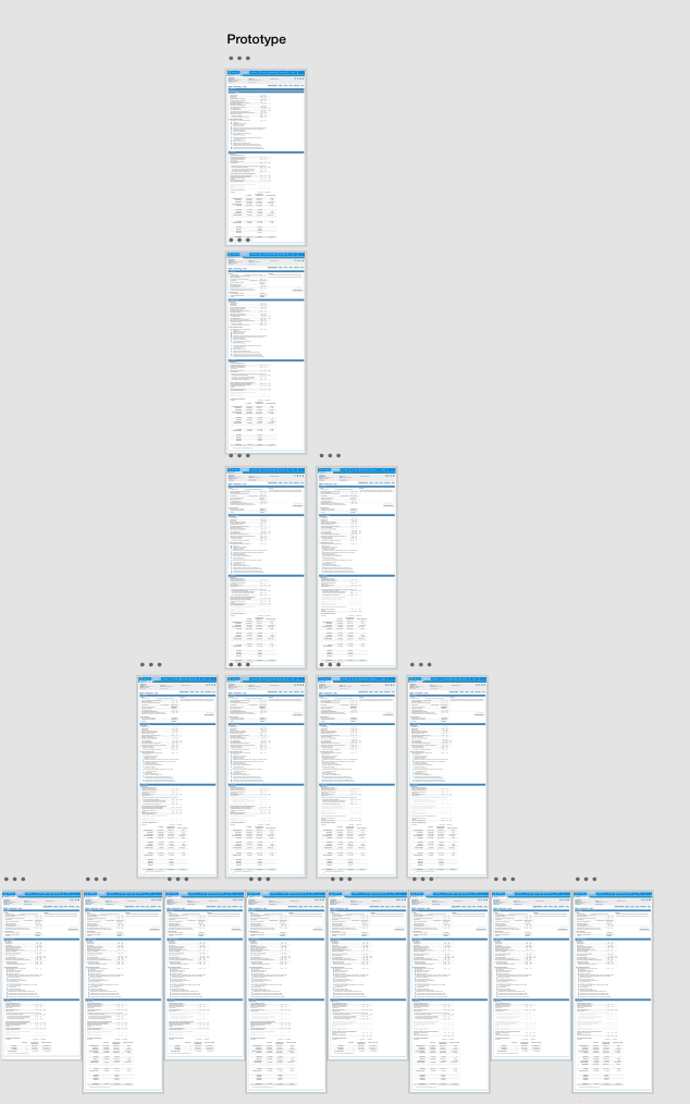
Prototype Screens
Lessons Learned
- Users were ecstatic about the time the new design would save them. As designer we should, at every step of the process, keep the user in mind. That seems obvious, but after hours of research and ideation, pushback from the technical side of things, and perhaps timelines quickly approaching we must remember to not prioritize those constraints instead of the user's overall experience.
- Can be intimidating working with users that were so skilled and knowledgable in their field with regards to SME knowledge gaps. However, by asking the user to explain their process and define terms that I hadn't understood, I was better able to define the problem. Don't be afraid to ask questions, early and often.
- Communication is key. Taking ideas to product and dev team early, generated incredible conversation and design ideation. Potential limitations were discussed early, preventing hours of wasted time. We were able to build open idea after idea, refining the application form.
Next Steps
The design process doesn't stop at product delivery of course. After launch, I went back and reviewed the live version, ensuring it matched the submitted design specifications. There were also a few changes requested by management on wording to better match SEC Regulations that were implemented.
Full Mockup

