
Client did not have a working style guide or template that could be used as a building block for the generation of Email Newsletters during their Health Campaigns.
Previously, the client would deliver a mockup to the Dev team but the sizing, spacing, and hierarchy of fonts would often be different. The launched version would, as a result, have small but significant variations.
Create a style guide to be used as a template with easy to use building blocks so any designer can quickly generate a design based on JIRA ticket requirements and developers can quickly digest, interpret, and execute, while also staying true to brand guidelines and medical campaign objectives.
My first step in generating the style guide was to take a look at existing wireframes the company had been using to develop desktop and mobile landing pages.
My concerns with the existing wireframes are listed below:
The next step was briefly looking at the competition to see what they execute well, and what could, perhaps, be improved upon.
First step was establishing font sizes to clearly define hierarchy, usage, and promote consistency across designs.

The Next step was defining usage of H1, H2 and Body Copy.

As well as image sizing, module spacing, and CTA guidelines.


With guidelines established, the next step was to begin building out the template modules.
I started with rough sketches in my notebook outlining the general direction for each module. Then, I transferred that to Sketch using the guidelines I had previously established.


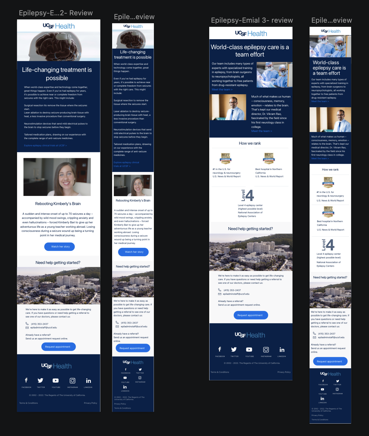
After reviewing the JIRA ticket for the goal of the campaign, and receiving the copy and photographs, I began the creation of the Desktop and Mobile mockups for the July Newsletter in Sketch.

Luckily, since the dimensions, spacing, and guidelines were already established in the style guide, it was mostly evaluating, and confirming that certain dimensions did in fact work with heirarchy, legibility, cohesiveness, while maintining the approachable feel of a children's hospital.